Client Challenge

Elevating the future.

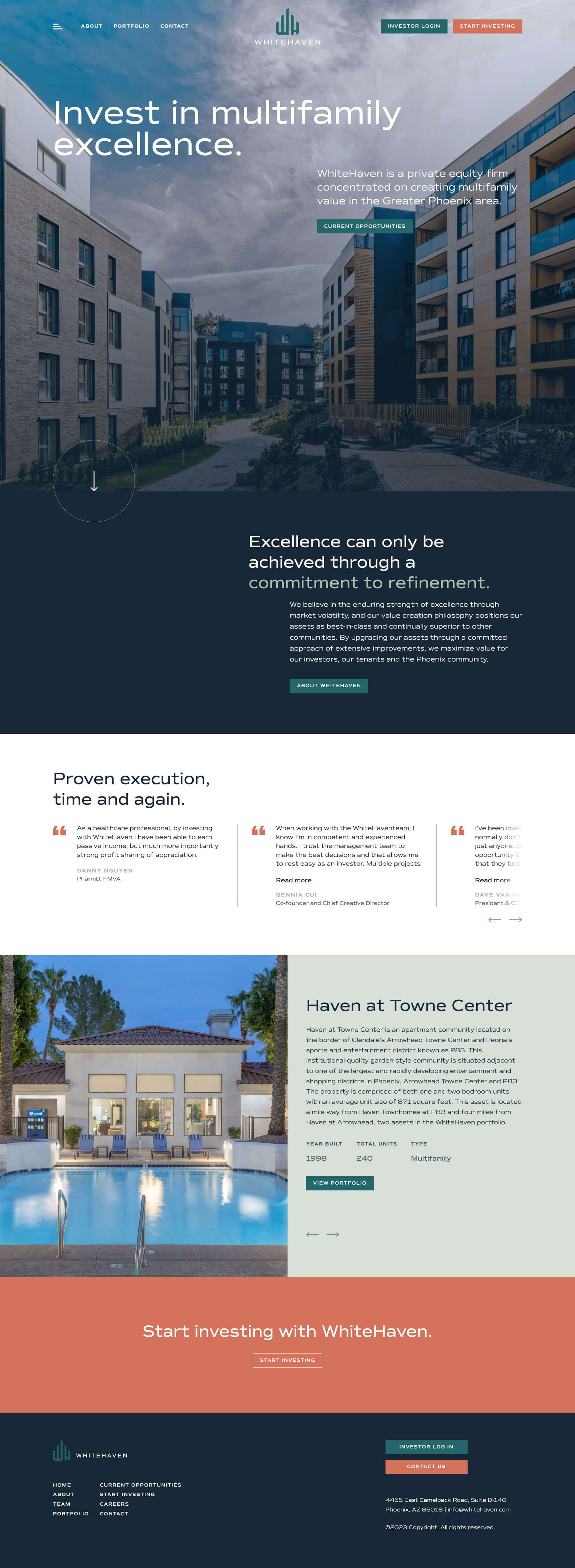
WhiteHaven, a private equity real estate investment firm, sought to revamp its B2B brand to better align with its institutional investors’ expectations. The primary goal was to establish a clear and recognizable brand identity that would not only support WhiteHaven, but also its subsidiary architectures and future growth. As a successful player in the industry, WhiteHaven aimed to maintain its position as a strong community partner as well as attract new clients and partners in the real estate industry. To achieve these goals, WhiteHaven needed a detailed branding strategy that would highlight its value and help expand its reach.

COHN Solution

Excellence achieved through refinement.

COHN’s strategic design approach was divided into two phases. In phase one, COHN conducted foundational brand work, which included brand strategy and messaging, brand expression and visual identity, logo development, and subsidiary architecture. COHN also created a brand book and style guide, which enabled cohesive internal and local rollout of marketing and sales materials. In phase two, COHN rolled out the WhiteHaven brand, which included corporate identity, business cards, stationery and folder design, email signature design, presentation template design, website design, trade show booth design support, brand launch party support, email designs, and event venue graphics such as wall graphics and photo backdrops. COHN’s approach ensured that WhiteHaven’s brand was consistent across all media and effectively communicated its value proposition to its audience.

Real Results

WhiteHaven launch results.

The collaboration between WhiteHaven and COHN helped create a consistent brand that reflects WhiteHaven’s sophistication and prominent position in the industry. The brand was successfully revealed during a launch party, where COHN received positive feedback from WhiteHaven, its clients, and institutional investors. COHN’s branding strategy played a key role in helping WhiteHaven achieve its goals of establishing a recognizable identity and ensuring that the subsidiary architecture aligned effectively.

Kaiser Permanente

Creative Design
Digital
Marketing + Media
Video