Our 2018 Annual Report Picks for Best Design and Marketing
If you are anything like my fellow marketing junkies at COHN, digging into a cool Annual Report is weirdly satisfying.
Sure, there usually are some interesting business and financial nuggets—but we love seeing how these companies tell those stories with visuals, animation, color and technology. This year, a few really cool annual reports stood out, and we wanted to spotlight them for our readers.
Also, if you’re wondering how we find these, check out Report Watch’s “Annual Report on Annual Reports” every year. They do a great job.
ABInBev

What we love:
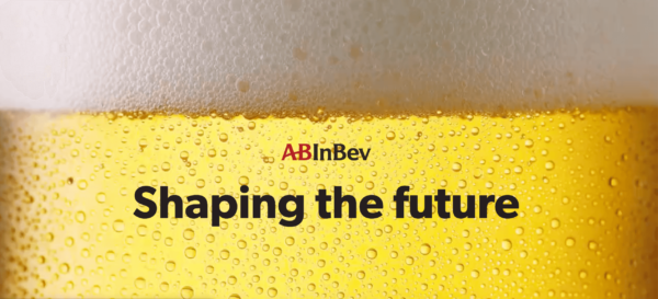
It opens with a beautiful, bubbling, blissful beer image that tells the reader, “Hey, I know we’re an absolutely massive global operation, but we’re just a beer company.” Outside of that fun load, the entire site is clean, playful and has all the development bells & whistles you could want.
L’Oréal

What we love:
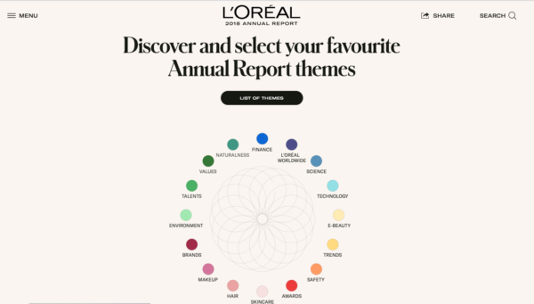
Drenched in smart branding, the team responsible for this Annual Report should take a bow. The color wheel just below the fold that serves as a navigation bar is just the cherry on top.
Shell

What we love:
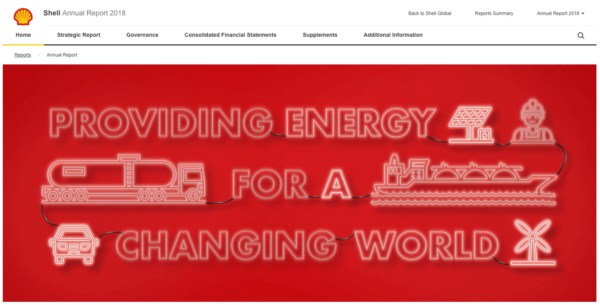
No fancy frills with this one, yet it’s still captivating as an Annual Report. The messages from the CEO and Chairman at the top read like a cover article from Fortune. Shell certainly knows its audience.
Putting together your Annual Report?
We know it’s a little early in the year, but when you’re ready to start putting together your Annual Report, give COHN a call. We take reporting documents to a whole other level with brand-specific touches that make stakeholders take note.
